• インフラジスティックス・ジャパン株式会社: 050 (1745) 6258
  • マイアカウント
Infragistics Infragistics
メニュー
  • マイ アカウント
    • ログイン
  • 開発
    • おすすめパッケージ
      Infragistics Ultimate¥260,000
      (税抜)
      Web、モバイル、デスクトップアプリ構築のためのUX / UIツールキット完全版
      Infragistics Professional ¥180,000​
      (税抜)
      Web、モバイル、デスクトップ開発者向けの包括的なUIコンポーネントライブラリ
      Ignite UI¥160,000
      (税抜)
      Webアプリを構築するためのUIコンポーネント完全版ライブラリ
    • WEB向け
      App Builder(New) Ignite UI Angular Blazor React Web Components Ultimate UI ASP.NET Core Ultimate UI ASP.NET MVC Ultimate UI jQuery Ultimate UI for ASP.NET Web Forms
    • デスクトップ向け
      Ultimate UI for Windows FormsUltimate UI for WPF
      クロスプラットフォーム向け
      Ultimate UI for Uno Ultimate UI for UWP Ultimate UI for WinUI Ultimate UI for Xamarin
    • Design to Code
      App Builder(New)Indigo.Design UIキット
      初めてご利用の方
      会社・製品概要のご紹介
  • UX
    • App Builderドラッグアンドドロップで Web アプリケーションを構築できる ローコード デザインツール
  • BIツール
    • Reveal様々なプラットフォームで簡単にダッシュボード作成やデータ可視化が可能な、組み込み型データ分析ツール
    • Slingshotデータ、プロジェクト管理、コンテンツ、チャット。チームの可能性を最大限に引き出すタスク・プロジェクト管理ツール
  • サービス
    • サービスとサポートご利用ニーズに合わせたサービス・サポートメニューをご用意しております。
    • 有償技術支援UX/UIや開発についての各種有償技術支援サービスをご提供しております。
    • React入門
      オンデマンド技術トレーニング(New)Reactトレーニング入門編 基礎からライブラリ導入まで学べます。
    • WPF入門
      オンデマンド技術トレーニングWPFを利用した Windows アプリケーション開発を新たに行う場合に最適なトレーニングです。
  • リソース
    • 製品ヘルプ
    • ナレッジベース
    • サンプルアプリケーション
    • お客様導入事例
    • ウェビナー
    • オンデマンド動画
    • ホワイトペーパー
    • ブログ
  • ご購入
    • ご購入ガイド
    • プランと価格
    • サポート環境
    • サポートポリシー
    • サブスクリプションとは
    • サブスクリプション更新
    • 販売パートナー
    • 法的情報
    • FAQ
  • 資料請求
  • 無料トライアル
  • お問い合わせ
 
WPF | Controls
  • Download Trial
Your Privacy Matters: We use our own and third-party cookies to improve your experience on our website. By continuing to use the website we understand that you accept their use. Cookie Policy
OK
お客様のプライバシーに関する事項
当社では、Webサイトでのお客様の利便性を向上させるために、自社およびサードパーティのクッキーを使用しています。また、これらのクッキーを使用することで、ユーザーの行動を分析し、継続的にWebサイトを改善することができます。下記のCookieポリシーとCookie設定をご確認ください。
設定の管理 OK
プライバシー設定
Webサイトを訪問すると、ブラウザに情報が保存または取得されることがあります。この情報は、お客様、お客様の好み、またはお客様のデバイスに関するもので、ほとんどの場合、お客様が期待するようにサイトを動作させるために使用されます。この情報は通常、お客様を直接特定するものではありませんが、よりパーソナライズされたWeb体験を提供することができます。当社はお客様のプライバシーの権利を尊重するため、一部の種類のCookieを許可しないよう選択することができます。ただし、一部の種類のCookieをブロックすると、サイトの利用や提供できるサービスに影響を与える可能性があります。
すべて受け入れる
ログインデータと優れたサイトパフォーマンスのために必要なCookie
Webサイトの機能や特徴をサポートするCookie
Cookie は、当社のサードパーティの広告パートナーによって提供され、お客様の閲覧習慣に関する情報を収集します
Cookieは、広告メッセージをお客様やお客様の関心により適したものにするために使用されます
すべて拒否 選択内容を確認
  • Grids & Lists
    • Carousel Listbox
    • Data Cards
    • Data Carousel
    • Data Grid
    • Data Presenter
    • Pivot Grid
    • Property Grid
    • Spreadsheet
    • Tree Grid
    • Tree List
  • Charts
    • Category Chart
    • 3D Surface Chart
    • Data Chart
    • Doughnut Chart
    • Financial Chart
    • Funnel Chart
    • Pie Chart
    • Scatter Chart
    • Shape Chart
    • Sparkline Chart
  • Barcodes
    • Barcode
    • Barcode Reader
  • Data Entry and Display
    • Color Picker
    • Combo Box Editor
    • Formula Editor
    • Inputs
    • MultiColumn Combo
    • Rich Text Editor
    • Spell Checker
    • Syntax Editor
  • Data Visualizations
    • Diagramming
    • Gantt View
    • Geographic Map
    • Network Node
    • Org Chart
    • Treemap
    • Zoombar
  • Frameworks
    • Calculation Manager
    • Drag and Drop Framework
    • Excel Library
    • Math Library
    • Persistence Framework
    • Syntax Parsing Engine
    • Undo Redo Framework
    • Word Framework
    • WPF Reporting
  • Gauges
    • Bullet Graph
    • Linear Gauge
    • Radial Gauge
  • Interactions
    • Busy Indicator
    • Dialog Window
    • Slider
  • Layouts
    • Carousel
    • Dock Manager
    • Tab
    • Tile Manager
  • Menus
    • Context Menu
    • Menu
    • Outlook Bar
    • Radial Menu
    • Ribbon
    • Tag Cloud
  • Scheduling
    • Calendar
    • Month Calendar
    • Schedule
    • Timeline
  • Styling & Themes
    • Resource Washer
    • Theme Manager
  • Productivity Pack
    • Configurators
WPF Category Chart

WPF Category Chart

This touch-enabled charting control makes visualizing category data a breeze. Built on top of a high-performing and feature-rich data chart, the category chart filters the complexities of data visualization into a simplified API that anyone can use.

Use the new Ultimate UI for WPF Category Chart Configurator to quickly configure the control and bind data directly from XAML—no code required!

DOWNLOAD WPF Samples

Easy Data Binding

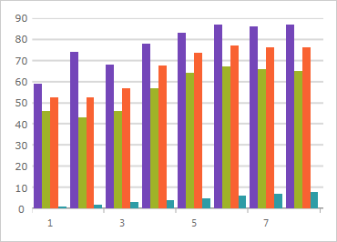
Bind a collection of data (or a collection of collections) to the ItemsSource property and the chart will analyze your data and automatically choose the best series to represent it. The chart will customize the look and feel for you.
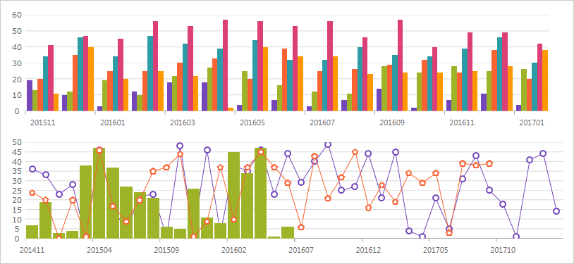
Easy Data Binding

A Wide Variety of Chart Types to Choose From

Make the most of your data with a chart for every need, including Line, Area, Column, Point, Spline, Waterfall, and more.

Variety of Chart Types

Intelligence & Style By Default

You don't even need to set labels with this intuitive control. The category chart will use the first appropriate string property found within the data for your labels. Data is analyzed and the appropriate visualization is rendered for you, easily and quickly, using a smart Data Adapter.

Intelligent and styled charts by default

Callouts Layer

Annotate important data points or customize values in callout boxes based on your logic (i.e. calculate maximum values in your data source).
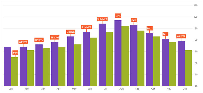
Callouts Layer

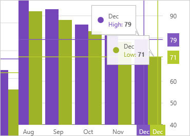
WPF Crosshair lines

Crosshair Lines

Renders a horizontal line, vertical line, or both at cursor location. Crosshair lines can snap to data points or interpolate between data points that are closest to the cursor.

Crosshairs Annotation

Crosshairs Annotation

Shows data point values at cursor location and renders these values in colored boxes over X and Y-axis labels.
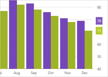

Final Values Annotation

Final Values Annotation

Shows value of the last data point in your data source. Renders one colored box for each data source over Y-axis labels.


Category Highlight Layer

Renders a vertical rectangle that stretches the span of the category closest to the cursor.
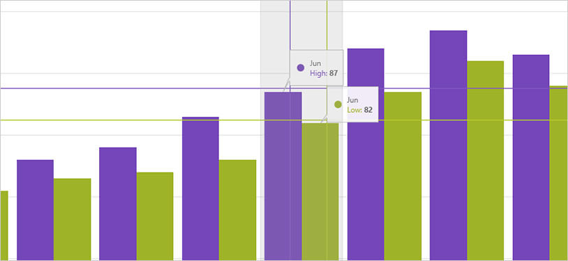
Category Highlight Layer

Item Highlight Layer

Renders a semi-transparent vertical rectangle for data items in the category closest to the cursor.
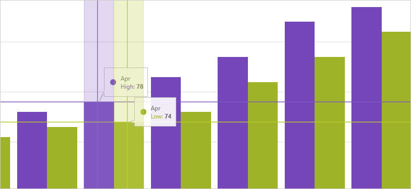
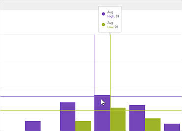
Item Highlight Layer

Category Tooltip Layer

Category Tooltip Layer

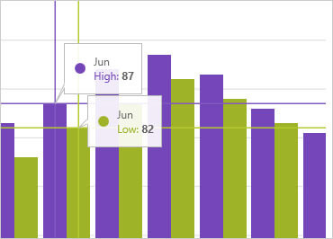
Renders a combined tooltip for all series in a data category.
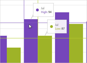

Item Tooltip Layer

Item Tooltip Layer

Renders an individual tooltip for each series in a data category.


Category Chart Configurator

The control configurators shave off hours of development time by removing the complexity of learning the Category Chart API. Visually configure your entire chart in a WYSIWYG point-and-click experience. Allow your designers to style controls interactively and visually to get a pixel-perfect render of their design intent.
Download Trial
Watch our how-to videos to explore the full capabilities of Control Configurators.

XAML Editor Example for WPF Category Chart Control

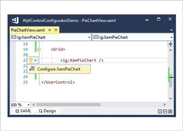
Launch the Category Chart Configurator with a Single Click

Select your control on the XAML editor and use the suggested actions lightbulb to launch the Category Chart  Configurator.


Visually Configure Your Category Chart

Use the Ribbon Gallery items to visually customize almost every aspect of your category chart – from the initial chart layout, to the Interactivity, Layout, Brushes, and Legend configuration. All without needing to know anything about the API of the category chart!
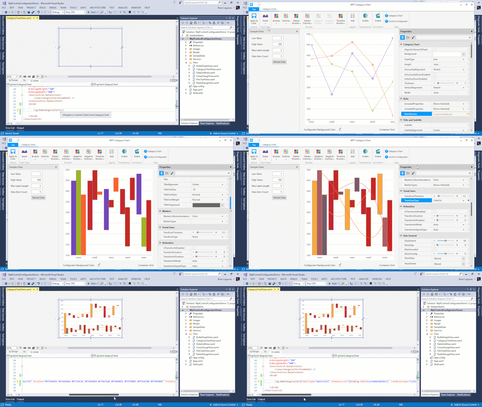
Ribbon Gallery Example for WPF Category Chart Control

Choose Your Chart Type

Make the most of your data with a chart for every need, including Line, Area, Column, Point, Spline, Waterfall, and more.
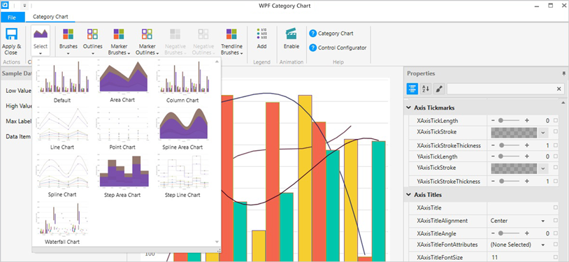
WPF Category Chart Customization Styles

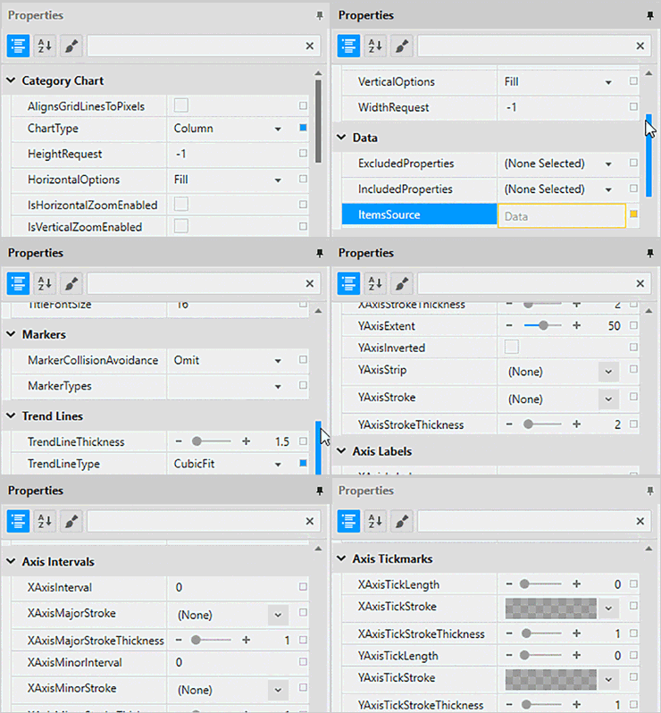
WPF Category Chart Control Property Editor

Property Editing with Ease

Conveniently find properties grouped by related features in the Property Editor. Features are also enabled or disabled by feature compatibility. This lets you customize any detail of the control, and it helps you learn by example, as you can see in real time how your changes affect the control.


Data Binding is a Breeze

You can quickly add dynamic data to inflate Low Value, High Value, and Label Length. Use the Binding Editor to easily set a binding for a control, including binding mode or your custom converter. We’ve even provided a handy formatter so you don’t need to think about how to display your values.
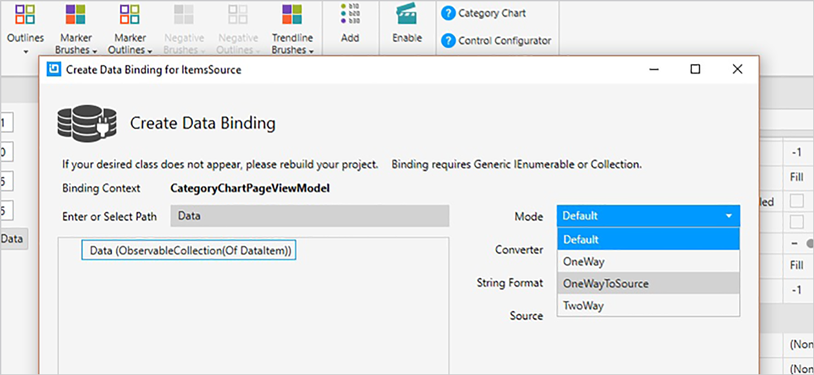
Data Binding Example for WPF Category Chart Control
  • 製品
    • 初めての方へ
    • 開発ツール
    • UXツール
    • データ可視化
    • コラボレーション
    • 無料トライアル
  • 購入について
    • ご購入ガイド
    • プランと価格
    • サブスクリプションとは
    • 販売パートナー
    • FAQ
  • ラーニング
    • ヘルプとAPIドキュメント
    • ナレッジベース
    • サンプルアプリケーション
    • ウェビナー
  • サポート
    • 製品ライフサイクル
    • サービスリリース情報
    • サポート環境
    • サポートポリシー
    • テクニカルサポートチャット
    • サービスヘルスダッシュボード
  • マイアカウント
    • サブスクリプションの管理
    • サポートアクティビティ
    • サポート要求の送信
  • 他社製品との比較
    • Ignite UI for Angular
  • 会社情報
    • 会社概要
    • ニュース
    • 採用情報
    • 法的情報
    • 提携パートナー
    • パートナープログラムへのお申し込み
メールマガジンのご案内

テクノロジーや弊社製品に関する最新情報、イベントやキャンペーン情報をお届けします!

購読する
  • プライバシーポリシー
  • クッキーポリシー
  • 利用条件
  • 特定商取引法に基づく表記
I.S. Partners SOC2 SEAL GDPR SEAL
© Copyright 2025 INFRAGISTICS. All Rights Reserved
Back to top of page