
Ignite UI Data Chart
The Ignite UI for JavaScript Data Chart is an HTML5 chart component built for high performance and flexibility. The Data Chart control is for developers who are familiar with charting and want the most flexibility in their charting components. It includes many great features and offers over 75 chart types. These charts render lightning fast, no matter how much data is in your data set.
The Ignite UI for JavaScript Data Chart offers a high degree of customization and flexibility. If you are looking for a simpler chart component with a more straightforward configuration process, please see the Ignite UI Category Chart.
View SampleReal-time Data
Data is constantly changing. While sometimes you want a snapshot of your data, other times you need to see that data live and in motion. Ignite UI for JavaScript's Data Chart component binds to real-time data sources and provides your users with a constant stream of information in an easy-to-understand visual.
 View Sample
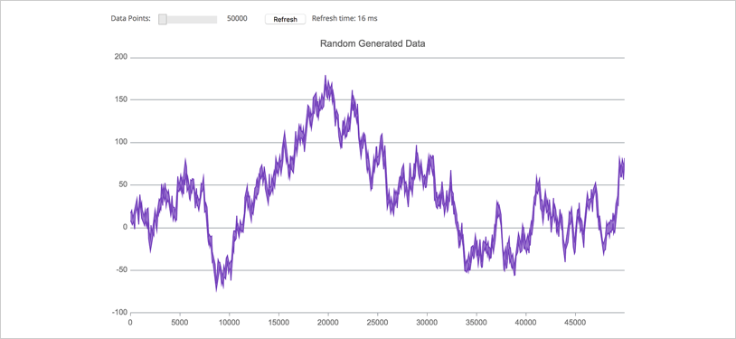
High-Volume Data
A company’s data is one of its most valuable assets. As companies recognize this, they search for ways to capitalize on the vast amounts of data at their disposal. Ignite UI for JavaScript’s Data Chart component can handle these large amounts of data easily and can quickly render your data into a great visualization.
 View Sample
Animation
Charts are great tools for working with business data. Ignite UI for JavaScript has many features, like animation, that bring together the “all business” aspect of charts with a great user interface that keeps your users engaged.
 View Sample
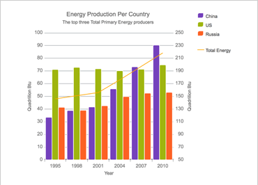
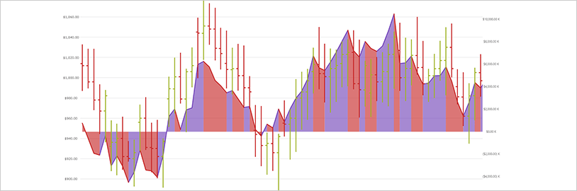
Composite Chart
Sometimes, your data is too complex to show easily in a standard, two-dimensional chart. For situations like this, use Ignite UI for JavaScript’s Data Chart component to create composite charts. By creating a chart with two Y-axes, you can show more complex visualizations, such as how two different sets of data relate to each other.
Scatter Area Series
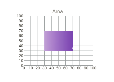
The Scatter Area Series draws a colored surface, in a Cartesian context, based on a triangulation of X and Y coordinates with a numeric value assigned to each pixel of the surface. You can use this series to plot scientific data such as strength of magnetic field, 3-D shapes projected or flattened onto a 2-D plane, or correlation among three numeric columns in your data.
Scatter Contour Series
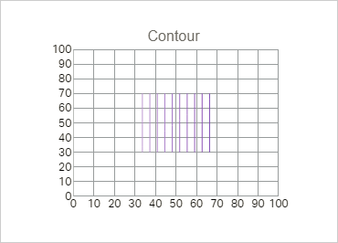
The Scatter Contour Series can plot the same data as Scatter Area Series, visualizing data using contour lines instead of interpolated surface area.

Scatter Polyline Series
The Scatter Polyline Series can plot outlines of custom shapes that are defined using a collection of collections of X/Y points. The series can show multiple connections between data points to indicate relegations or even build a view of networks.
Scatter Polygon Series
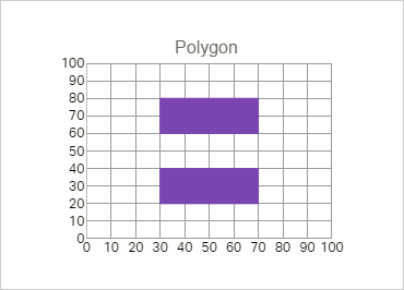
The Scatter Polygon Series can plot custom filled shapes that are defined using a collection of collections of X/Y points. The series can be used to highlight regions in the plot area of the chart.
Date/Time Axis
The Date/Time Axis is an improved time axis that supports breaks, dynamic intervals and dynamic labeling. The Breaks collection enables developers to configure the X-axis to omit dates in a range, such as weekends or other insignificant periods. The Intervals collection makes it easy to specify conditional label intervals based on the visible range of the axis, such as labels for each month when a year is visible. Label formats can also be configured according to the visible range.

Final Values Annotation
Shows value of the last data point in your data source. Renders one colored box for each data source over Y-axis labels.

Crosshairs Annotation
Shows data point values at cursor location and renders these values in colored boxes over X and Y-axis labels.
Callouts Layer
Annotate important data points or customize values in callout boxes based on your logic (i.e. calculate maximum values in your data source).
